Why Does Wix Keep Cutting Off My Website Layout?
- Wix Doctor

- May 21
- 4 min read
Quick Answer
Wix Editor is not responsive. It uses fixed-width gridlines to create a “safe area” for your content. If text, images, buttons, or decorative elements sit outside those gridlines, they can get cut off on smaller screens or different monitor sizes. Keeping your content inside the gridlines will fix the issue.
Is Wix Editor Responsive or Adaptive?
Wix Editor is designed to be adaptive rather than fully responsive. Instead of completely rebuilding your layout for every screen size, it fits your content into a defined “safe area” to help keep things consistent across desktops and laptops.
If important content like text, buttons, or images sits outside that safe area, parts of your layout can get cut off on smaller screens or narrower browser windows.
In most cases, the fix is simply to make sure your important content stays within the gridlines.
What Are Gridlines in Wix Editor?
Gridlines are the vertical dotted lines you see inside the editor. They mark the “safe area” where your main content should live.
Anything important should stay inside these lines, including:
Headings
Paragraph text
Buttons
Forms
Main images
Contact details
Menus
Elements placed outside the gridlines may still look fine on your screen, especially on a large monitor, but visitors using smaller laptops or narrower browser windows might see parts of the layout disappear.

Why Does It Look Fine in the Editor but Broken Live?
This catches a lot of people out, Wix Editor previews your site based on the width of your current browser window and monitor. If you’re designing on a large screen, you may accidentally place content too close to the edges without realising it.
When somebody visits your site on a smaller screen, Wix has to fit everything into a narrower space. Anything hanging outside the safe area may become clipped or hidden.
This is one of the biggest differences between Wix Editor and modern responsive builders.

Wix Editor Is Adaptive, Not Fully Responsive
Wix Editor was built around a fixed-width layout system. It adapts your site to fit different screen sizes, but it doesn’t completely restructure content automatically the way Wix Studio does.
That’s why spacing, positioning, and gridlines matter so much in Editor.
For many websites, Wix Editor works perfectly well once it’s structured correctly. But if you need:
Highly flexible layouts
Complex responsive behaviour
Advanced scaling
Modern breakpoint controls
…then Wix Studio may be a better fit.
Wix Doctor also offers Editor-to-Studio migration services if your current site has outgrown the standard Editor.
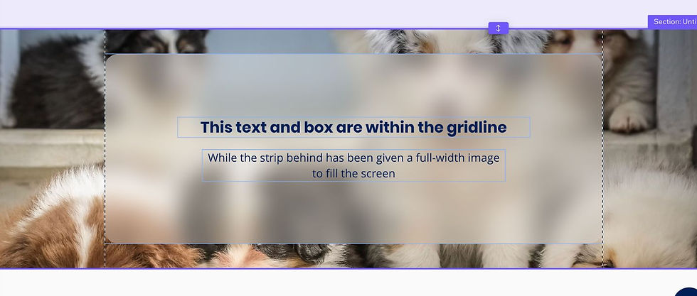
Want Full-Width Sections Without Layout Problems?
A very common mistake is stretching text, buttons, or images all the way across the screen to try to create a modern full-width design, which will cause layout issues.
Instead, keep your important content safely inside the gridlines and use:
Section backgrounds
Strip backgrounds
Background images
Background colours
…to create the visual effect of a full-width design.
This gives you a much cleaner and more reliable layout across different screen sizes.
Using Columns Properly in Wix Editor
Inside strips, you can split layouts into columns. Each column creates its own content area and helps Wix organise the layout more predictably.
Columns are useful for:
side-by-side content
service boxes
image/text layouts
feature sections
testimonials
call-to-action panels
Each column can also have:
its own background colour
its own background image
different spacing
separate content alignment
Using columns properly usually creates much more stable layouts than manually dragging elements around the page, and also makes the mobile layout much easier to work with.

Avoid “Floating” Elements Wherever Possible
Another common cause of layouts breaking is manually placing elements without structure.
For example:
text floating freely over images
buttons manually aligned by eye
overlapping elements
decorative graphics hanging off sections
These might look good temporarily, but they often become unstable across different screen widths.
Using:
Strips
Columns
Repeaters
Boxes
…creates much more reliable layouts.
Quick Ways to Check Your Layout
Before publishing your site:
Preview it at different browser widths
Resize your browser window slowly
Test on a laptop, not just a large monitor
Check tablet and mobile layouts separately
Look for buttons or text close to the gridline edges
You’ll usually spot problems very quickly this way.
No More Cut-Off Designs!
Most Wix layout problems are not actually “bugs.” They usually come from content sitting outside the safe area or layouts being built without enough structure.
Once you understand how Wix Editor handles spacing and screen widths, building stable layouts becomes much easier.
And if your site needs more advanced responsive behaviour, Wix Studio gives you far more control over how layouts adapt across different screen sizes.
Comments