CSS Snippet:
Glassmorphism Toggle Switch
This CSS snippet applies a glassmorphism effect to the native Wix toggle switch using transparency, blur, and subtle borders.
It enhances the default switch with a modern, frosted glass appearance while keeping full Wix functionality intact.
Difficulty:
Hard
Live preview
Glassmorphism
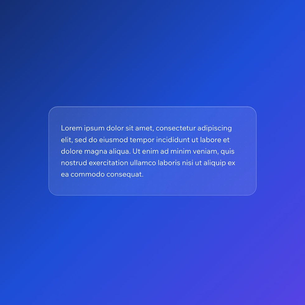
Lorem ipsum dolor sit amet, consectetur adipiscing elit, sed do eiusmod tempor incididunt ut labore et dolore magna aliqua. Ut enim ad minim veniam, quis nostrud exercitation ullamco laboris nisi ut aliquip ex ea commodo consequat.
Use case
Use this toggle style when you want a modern, UI-driven look that pairs with glassmorphism layouts.
It works especially well in dashboards, overlays, hero sections, or any design using gradients or blurred backgrounds.
Where to apply it
Apply this class to a native Wix Switch element.
Common examples include:
• Settings panels
• Feature toggles
• Dashboard controls
• Overlay interfaces
This style works best when placed on top of a gradient or image background to allow the blur effect to show.
Notes & Setup
Add a native Wix Switch element to your page.
Add the class: glass-toggle
Paste the CSS into your site's Custom CSS section.
Before applying the CSS, open the Design panel and manually adjust all toggle states.
For Switch ON:
• Regular
• Hover
• Focus
• Disabled
For Switch OFF:
• Regular
• Hover
For each state:
• Remove all borders
• Set colours to neutral or transparent values
Wix does not provide a "set once for all states" option, so this must be done manually.
For best results, place the toggle over a gradient or image background so the blur effect is visible.
Customisation
Background:
Glass effects rely on what sits behind them. Use gradients, images, or colour transitions to get the best result.
Blur:
The blur strength can be adjusted using backdrop-filter. Higher values increase the frosted effect.
Transparency:
Adjust the rgba values to make the glass more or less opaque.
Consistency:
This toggle is designed to match glass buttons and containers. Use them together for a cohesive UI.
Scope:
This styling is applied using a custom class, so it will not affect other toggles on your site.
Licensing
This CSS snippet is free to use in personal and commercial Wix Studio projects. You’re welcome to copy, adapt, and use it on client or business websites.
Credit is not required, but if you found it useful, we’d really appreciate a small link back to Wix Doctor, ideally on your site’s footer, about page, credits page or wherever feels appropriate.
Linking back helps more Wix users discover the library and supports the continued creation of free snippets, tutorials, and community resources.
CSS Code
css
.glass-toggle .switch__track {
background: rgba(255, 255, 255, 0.2);
border-radius: 999px;
backdrop-filter: blur(10px);
-webkit-backdrop-filter: blur(10px);
border: 1px solid rgba(255, 255, 255, 0.3);
box-shadow: 0 4px 20px rgba(0,0,0,0.1);
transition: all 0.3s ease;
}
.glass-toggle .switch__handle {
background: rgba(255, 255, 255, 0.4);
border-radius: 50%;
backdrop-filter: blur(10px);
-webkit-backdrop-filter: blur(10px);
border: 1px solid rgba(255, 255, 255, 0.4);
box-shadow: 0 4px 10px rgba(0,0,0,0.15);
transition: all 0.3s ease;
}
.glass-toggle[data-checked="true"] .switch__track {
background: rgba(255, 255, 255, 0.3);
}
.glass-toggle[data-checked="true"] .switch__handle {
background: rgba(255, 255, 255, 0.6);
}