CSS Snippet:
Noise Glass Container
This CSS snippet creates a textured glass-style container with blur, transparency, and a subtle noise overlay. The frosted effect lets background colour show through, while the added grain gives it a more realistic, design-led finish.
Compared to standard glassmorphism, this style feels moodier, richer, and more premium.
Difficulty:
Intermediate
Live preview
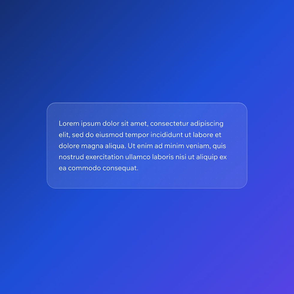
Glassmorphism (Noise)
Lorem ipsum dolor sit amet, consectetur adipiscing elit, sed do eiusmod tempor incididunt ut labore et dolore magna aliqua. Ut enim ad minim veniam, quis nostrud exercitation ullamco laboris nisi ut aliquip ex ea commodo consequat.
Use case
Use this container when you want a more elevated glass effect that feels less flat and more polished than standard frosted UI.
It works particularly well for premium layouts, feature sections, and overlays placed on gradients or rich backgrounds.
Where to apply it
Apply this class to containers placed on top of colourful, dark, or visually rich backgrounds.
Common examples include:
• Hero sections with gradients or images
• Premium callout panels
• Overlay cards
• Modern app or SaaS interfaces
This style relies on what sits behind it, so it works best when the background has enough contrast for the blur and texture to show through.
Notes & Setup
Select your container in Wix Studio.
Add the class: noise-glass-container
Paste the CSS into your site's Custom CSS section.
For best results, place it on top of a gradient, image, or darker background so the blur and texture effects remain visible.
You can reduce the texture by lowering the opacity value in the ::before layer, or make the glass softer by increasing the blur value.
Customisation
Texture Strength:
To make the noise more or less visible, adjust the opacity value in the ::before layer:
opacity: 0.16;
Lower values = more subtle
Higher values = more textured
Blur:
To change the frosted glass intensity, adjust the blur value:
backdrop-filter: blur(16px);
Lower values = clearer background
Higher values = softer, frostier effect
Glass Tint:
To make the glass lighter or darker, change the background opacity:
background: rgba(255, 255, 255, 0.10);
Lower opacity = more transparent
Higher opacity = more solid glass look
Tip:
This style works best on rich backgrounds where the blur and noise can actually be seen. On plain white sections, it will lose most of its effect.
Licensing
This CSS snippet is free to use in personal and commercial Wix Studio projects. You’re welcome to copy, adapt, and use it on client or business websites.
Credit is not required, but if you found it useful, we’d really appreciate a small link back to Wix Doctor, ideally on your site’s footer, about page, credits page or wherever feels appropriate.
Linking back helps more Wix users discover the library and supports the continued creation of free snippets, tutorials, and community resources.
CSS Code
css
.noise-glass-container {
position: relative;
padding: 24px 28px;
border-radius: 20px;
background: rgba(255, 255, 255, 0.10);
backdrop-filter: blur(16px);
-webkit-backdrop-filter: blur(16px);
border: 1px solid rgba(255, 255, 255, 0.22);
box-shadow:
0 8px 30px rgba(0, 0, 0, 0.12),
inset 0 1px 0 rgba(255, 255, 255, 0.18);
overflow: hidden;
}
/* Stronger texture layer */
.noise-glass-container::before {
content: "";
position: absolute;
inset: 0;
border-radius: 20px;
pointer-events: none;
opacity: 0.16;
background-image:
radial-gradient(rgba(255,255,255,0.28) 0.7px, transparent 0.7px),
radial-gradient(rgba(0,0,0,0.18) 0.7px, transparent 0.7px);
background-position: 0 0, 6px 6px;
background-size: 12px 12px;
}
.noise-glass-container * {
position: relative;
z-index: 1;
color: #ffffff;
}